- Go to the Reusable Elements tab.
- Right-click the User Interface Groups node and select Create New Style Group.
- Click the new style group node and set the attributes:
- Name: Change the name to a meaningful name for display in the explorer in Alfabet Expand.
- Caption: Change the caption to a meaningful caption for display in the Alfabet user interface in the views to edit the coloring for a new custom theme.
- Type: Select Enum.
- For each release status, do the following:
- Right-click the style group node and select Create Style.
- Click the new style node and change the Name and Caption attributes to match one of the release status values in your release status definition.
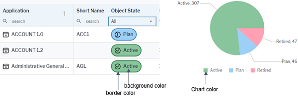
- Expand the style node, click the child nodes and set the Default Color attribute for the following colors:
- Chart Color: The color used in business charts to represent the release status value.
- Background Color: The background color used in data workbenches and content areas for the release status value.
- Border Color: The border color used in data workbenches and content areas for the release status value.
- Color: The font color used for the text of the release status value in data workbenches and content areas.
- Go to the Presentation tab.
- Double-click XML Objects > ReleaseStatusDefs.
- In the XML element Status of a release status value, add the XML attribute UIStyle and set it to <NameOfStyleGroup>:<NameOfStyle>