Modify buttons in graphic views and configured reports
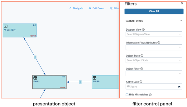
Technically, a graphic view consists of a presentation object and a control panel. The presentation object consists of the graphic or table of the view and the toolbar. The control panel is optional. It contains filter controls. The button for filter update is part of the filter control panel and can be altered in the same way as filter controls. All other buttons are part of the presentation object.
When selecting the class settings for altering a view, you must consider which object class the view is defined for:
- Most graphic views are specific for an object class. These graphic views start with the ID prefix of the object class, like for example, APP for applications. You must use the class settings of that object class or one of its object class stereotypes to modify the graphic view.
- Other graphic views can be used for multiple object classes. These views can have different settings for different object classes. For example, the view ObjectEvaluation can be used for all object classes to which evaluation types are assigned. If you modify the view in the class settings of an object class, the modifications only apply if the object the user is currently working with belongs to that object class.
- A limited number of views has no object class context, like the views for performing a search or scheduling a job. You must alter these views in ALFA_GLOBAL_CLASS_SETTINGS.
When altering a button, you should use an Alfabet Web Application which is rendered in design mode. In design mode, you can view the technical name of elements on the user interface and also start your button modification directly in the user interface in the view you want to change.
-
- Log in to the Alfabet user interface with the user profile you would like to modify buttons for.
- Navigate to a view which you want to change buttons for. You can see the technical name in brackets on the left of the three-dot menu. You will need this view later to identify the view in Alfabet Expand.
- In the three-dot menu of the view, select Configure Buttons.
- In the dialog, all buttons are listed with their configuration state. Buttons which are not yet modified show Default in the Configuration column. You can click the configuration state value and change the value:
- Select Custom to add this button to the relevant class settings in Alfabet Expand where you can change the settings for the button in the next step.
- Select NoAccess to add this button to the relevant class settings in Alfabet Expand and set the Access in User Interface attribute to NoAccess. The button will immediately be removed from the view for all users using the relevant class settings in the user profile they are logged in with. You need to refresh the view to see this effect.
- If you set buttons to Custom , open Alfabet Expand.
- Go to the Presentation tab.
- In the explorer, expand the nodes Class Settings > the base object class of the view > the class settings used in the view scheme > Presentation Objects.
- You can see the technical names of all views for which button modifications have been added. Expand the node of the view you altered buttons in.
- For each button you set to Custom, click the node of the button and change the attributes:
- Access in User Interface: Select NoAccess to hide the button or Access to show the button.
- Caption: Enter a new caption that shall be displayed instead of the standard caption of the button.
- Selector Definition: If the button opens a selector and multiple selectors are available for selecting objects of the object class a user shall select, you can select one of the applicable selectors to open instead of the standard selector.
- Default Editor: If the button opens an editor and multiple editors are available for selecting objects of the edited bject class a user shall edit, you can select one of the applicable editors to open instead of the standard editor.
- Conditions: If you want the button to be visible under specific circumstances only, you can create a condition configuration object that is testing whether the specific circumstances apply. You can then select the condition object in this attribute. The button will be visible if the condition applies. For example, a button shall only be visible for users in user group B. The condition checks the user group configuration for the current user at runtime and hides the button if the user is not member of user group B.
- Presentation Object Owner: You can hide the button in a defined context only. For example, the configured report is available in two different content areas for the same object class and you want to hide filter setting in one of the content areas because it is important that a user sees the complete report in the given context. First select the type of superordinate configuration object the view is embedded in in the Owner Type attribute. Then select the configuration object in the Owner Name field.
-
- Go to the Presentation tab.
- In the explorer, expand the nodes Class Settings > the object class (stereotype) you would like to edit > the class settings you would like to edit.
- Right-click the Presentation Objects node and select Modify Presentation Object Behavior.
- Select the presentation object from the list. In general, presentation objects have the same name as the graphic view they belong to.
- Right-click the node for the presentation object and select Modify Button.
- Select the button in the selector.
- Click the node of the button and change the attributes:
- Access in User Interface: Select NoAccess to hide the button or Access to show the button.
- Caption: Enter a new caption that shall be displayed instead of the standard caption of the button.
- Selector Definition: If the button opens a selector and multiple selectors are available for selecting objects of the object class a user shall select, you can select one of the applicable selectors to open instead of the standard selector.
- Default Editor: If the button opens an editor and multiple editors are available for selecting objects of the edited bject class a user shall edit, you can select one of the applicable editors to open instead of the standard editor.
- Conditions: If you want the button to be visible under specific circumstances only, you can create a condition configuration object that is testing whether the specific circumstances apply. You can then select the condition object in this attribute. The button will be visible if the condition applies. For example, a button shall only be visible for users in user group B. The condition checks the user group configuration for the current user at runtime and hides the button if the user is not member of user group B.
- Presentation Object Owner: You can hide the button in a defined context only. For example, the configured report is available in two different content areas for the same object class and you want to hide filter setting in one of the content areas because it is important that a user sees the complete report in the given context. First select the type of superordinate configuration object the view is embedded in in the Owner Type attribute. Then select the configuration object in the Owner Name field.