Change the design of the user interface
You can change the colors of the user interface and substitute the Alfabet BD GmbH logo with your company's logo to adapt the styling of the user interface to your company's corporate identity. You can define multiple different custom themes with individual logo assignments and coloring. Users will be able to choose from the defined custom themes and use the one they like best. Most users have a preference for either dark or light coloring of user interfaces. Coloring also plays an important role in 508 compliance.
Administrative users can define custom themes for the user community directly in the user interface. You can also define custom themes in Alfabet Expand as a default. For the default custom themes, you can allow or disable that the custom theme can be changed on the user interface.
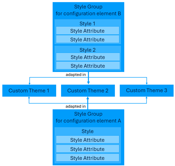
Custom themes are based on style groups each defining the coloring of a defined element of the user interface configuration. The definition of style groups is independent from the definition of custom themes. All custom themes use the same style groups. There are style groups for general parts of the user interface like menu items, but also individual style groups for each enumeration used or for coloring of reports and cards. When you add enumerations, cards and reports to the user interface configuration in Alfabet Expand, the definition of a style group for your new configuration should be a part of the configuration effort. With the definition of a style group for a new configuration item you provide the means to have a different styling of the configuration item in different custom themes. For example, a configured report can display items in different shades of green or in different shades of purple depending on the custom theme the user has choosen. You can define style groups in Alfabet Expand only.
A style group consists of one or multiple styles defined for a specific purpose. For example, a style group for an enumeration has one style per enumeration item in the enumeration. Each style consists of a number of style attributes defining different aspects of the style. For example, for enumeration items, there are style attributes for the definition of background color, foreground color, border color, and chart color. Within the style definition, a value is assigned to each style attribute. This value is the default for all custom themes. If you want a style to change for a custom theme, you can assign the style group to the custom theme and define a different value for the style attributes within the custom theme definition.

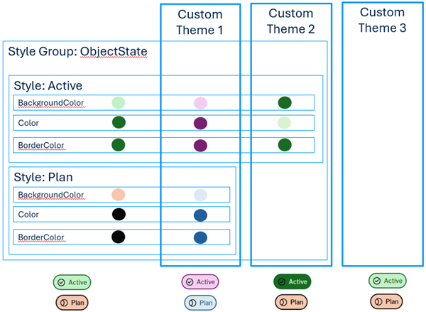
For example, the ObjectState enumeration has a style group with styles for all enumeration items in the enumeration. The following scheme shows the different levels of adaptitions of the style group in different custom themes and the resulting coloring on the user interface.

The following terms are used in the documentation:
- Style group: A style group is a collection of styles for a specific group of items, for example for coloring the enumeration items of an enumeration.
- Style: A style defines the coloring of an item, for example a single enumeration item or a box displayed in a configured report. A style consist of all aspects of the visualization, like font color, background color, and border color.
- Style attribute: A style attribute is a single aspect of visualization, like color or icon, defined in a style. It consists of a name, a caption and a value.
- Custom Theme: A custom theme defines values for style attributes which are deviating from the default values defined in the style. A custom theme can for example define high contrast coloring to enhance 508 compliance or use the colors and logos of a company's corporate identity instead of the default coloring of the Alfabet user interface. Users can select between all available custom themes to view the user interface in the color scheme they like best.
- Style attribute default value: The value defined in a style attribute, like a color or icon. This value is the default value used for all custom themes which do not have a deviating definition for the style attribute.
- Style attribute value: The value defined for a style attribute in a custom theme.