Set up the board visualization
Board visualizations present portfolio data as cards arranged in user-defined columns, giving teams an immediate, intuitive view of task status, ownership, and upcoming work. Inspired by Kanban boards, they offer instant clarity, support effortless prioritization through drag-and-drop reordering, and strengthen collaboration by ensuring everyone sees the same information during shared decision-making processes such as application portfolio rationalization or strategic prioritization.
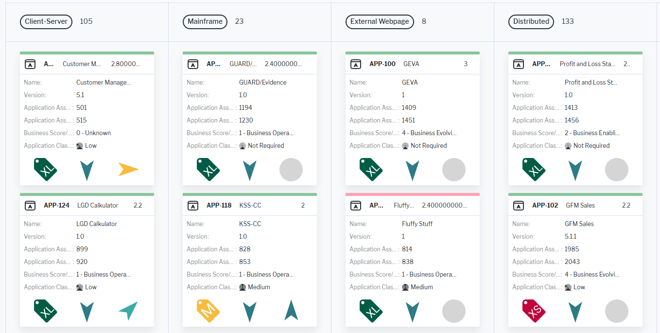
Cards can be colored based on enumeration values or indicator ranges and you can configure up to three attributes to appear in the card header, and display and order up to seven additional attributes and three icons within the card body.
A single click on any object or referenced object shown on a card opens it in the object inspection pane for preview and editing, while a double-click navigates directly to its content area. Cards can also be dragged between columns, automatically updating the object’s value associated with that column. Cards cannot be sorted within a column via the drag-and-drop functionality.
Click Visualize > Board Visualization.
The assets visible in the visualization are based on the definition made in the data table. To add or remove assets, click Visualize > Data Table. Click the Structure button to change the content. Click to learn more about how to specify the data you want to see.
- Expand or collapse the cards. Users can switch between expanded cards, which display full details, and collapsed cards for a more compact view. Click Expand All to show all details of a card. Click Collapse All to show the compact view with only the card header attributes displayed.
-
Define the board visualization settings. Click Board Settings to open the editor:
- Group By (Column Definition): Select one value to determine the columns to display. You can select a role (non-plural, filled by a single person or organization), release status, enumeration, reference-type property, or indicator with a range definition.
Grouping also acts as an additional filter. Assets with no value for the selected grouping attribute will not be displayed any longer in the board.
- Object Categorization/Coloring: Select an attribute that should be used to add color to the cards. Colors are only displayed if the attribute has background color style defined. Such attributes are also colored in the data table.
- Card header: Specify an optional class icon and up to 3 attributes to display in the header. If the cards are collapsed in the board, users will still see the card header.
- Show Class Icon: Select to add the class icon for the card's asset to the card header.
- First Attribute, Second Attribute, and Third Attribute: Select an attribute to display in the header.
- Group By (Column Definition): Select one value to determine the columns to display. You can select a role (non-plural, filled by a single person or organization), release status, enumeration, reference-type property, or indicator with a range definition.
-
Card Icons: Select up to 3 icons to show in the body of the card. Use the 6-dots buttons
 in the Card Icons list to order the icons in the card.