
Ad-hoc analytics rely on the data that is visible in the data table. Therefore, it is important to reduce the data so that your visualization is meaningful. The number of objects which can be displayed in business charts is limited to 50 to ensure readability of the graphic. There are two ways to specify the data in the data table for the visualization:
- Select the checkboxes
 for the individual assets you want to visualize in the ad-hoc analytics. If at least one checkbox is selected, the reports will ignore all other data. Therefore, be sure that only one asset is not inadvertently selected.
 - Set filters in the data table to reduce the amount of data that is displayed. If no checkbox is selected for an asset, all data displayed in the data table is used as the data source for the reports. Click to learn how to filter the data in the data table.
If the data workbench is filtered to show only applications that have the Recommendation attribute set to Migrate, only those applications would be displayed in the ad hoc reports like bar chart, matrix report, etc. or in a preconfigured report like Application Expenses by Cost Type.
Set up the bar chart
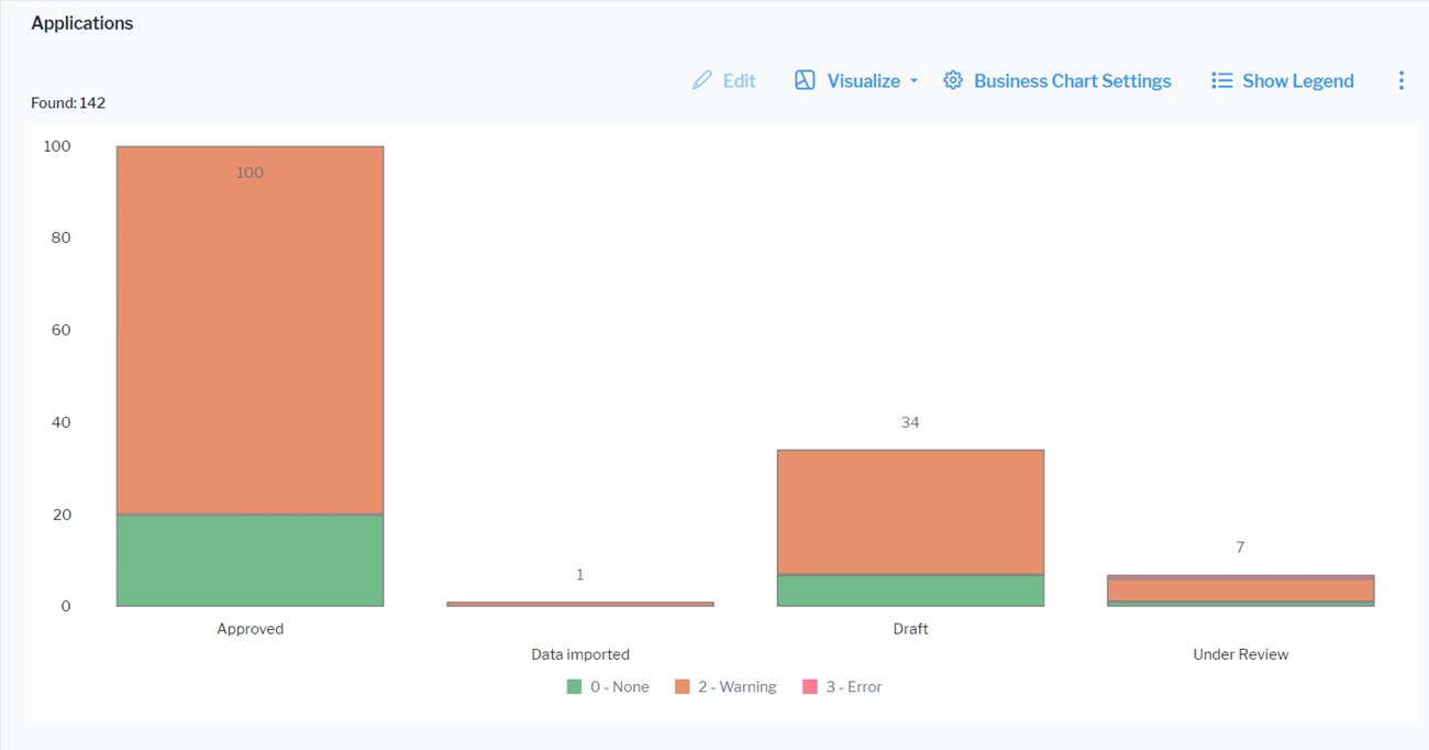
Click Visualize > Business Charts > Bar Chart. Click Business Chart Settings to set up the bar chart.
The assets visible in the visualization are based on the definition made in the data table. To add or remove assets, click Visualize > Data Table. Click the Structure button to change the content. Click to learn more about how to specify the data you want to see.
Define the data to display in the Data Visualization tab.
- X-Value: Select one or more attributes to show as the value on the X-axis.
- Y-Value: Select either <Record Count> to show the total number of records or a different number value to display on the Y-axis.
- Series: Select one or more attributes to specify a data series to further distinguish the results based on a selected attribute. The series is represented by bars of the same color in a bar chart. In a stacked layout, bars of different series are displayed on top of each other.
You can optionally change the layout in the Layout tab.
- Chart Title: Define a title for display on top of the chart.
- X-Axis Title: Define a title for display beneath the X-axis.
- Y-Axis Title: Define a title to display along the Y-axis.
- Bar Layout: Select Normal to display bars next to each other, Stacked to display bars on top of each other and Overlapped to display one bar behind the other.
- Bar Orientation: Select Horizontal to show bars stretching from left to right or Vertical to show bars stretching from top to bottom.
-
Hide Value Labels: Set a checkmark to hide value labels on bars. Value labels provide information about the number the bar represents.
Stacked bars never show labels independent from this setting.
- Background Color: Select a color to change the color of the chart background.
- Number Prefix: Enter a prefix to display before the numerical value. For example, enter a currency symbol to add it in front of a monetary value in the value labels. There will be no white space between the prefix and the number.
- Y-Minimum Value: By default, the range of the Y-axis is adjusted to the maximum and minimum Y-values in the chart. Set this attribute to enforce a start point for the Y-axis. For example, define the same Y-axis range for multiple charts to make it easier to compare the values in the charts. If an Y-value in the chart is smaller than the selected minimum value, the minimum value setting will be ignored to ensure that all data is displayed.
- Y-Maximum Value: By default, the range of the Y-axis is adjusted to the maximum and minimum Y-values in the chart. Set this attribute to enforce an end point for the Y-axis. For example, define the same Y-axis range for multiple charts to make it easier to compare the values in the charts. If an Y-value in the chart is higher than the selected maximum value, the maximum value setting will be ignored to ensure that all data is displayed.
Set up the line chart
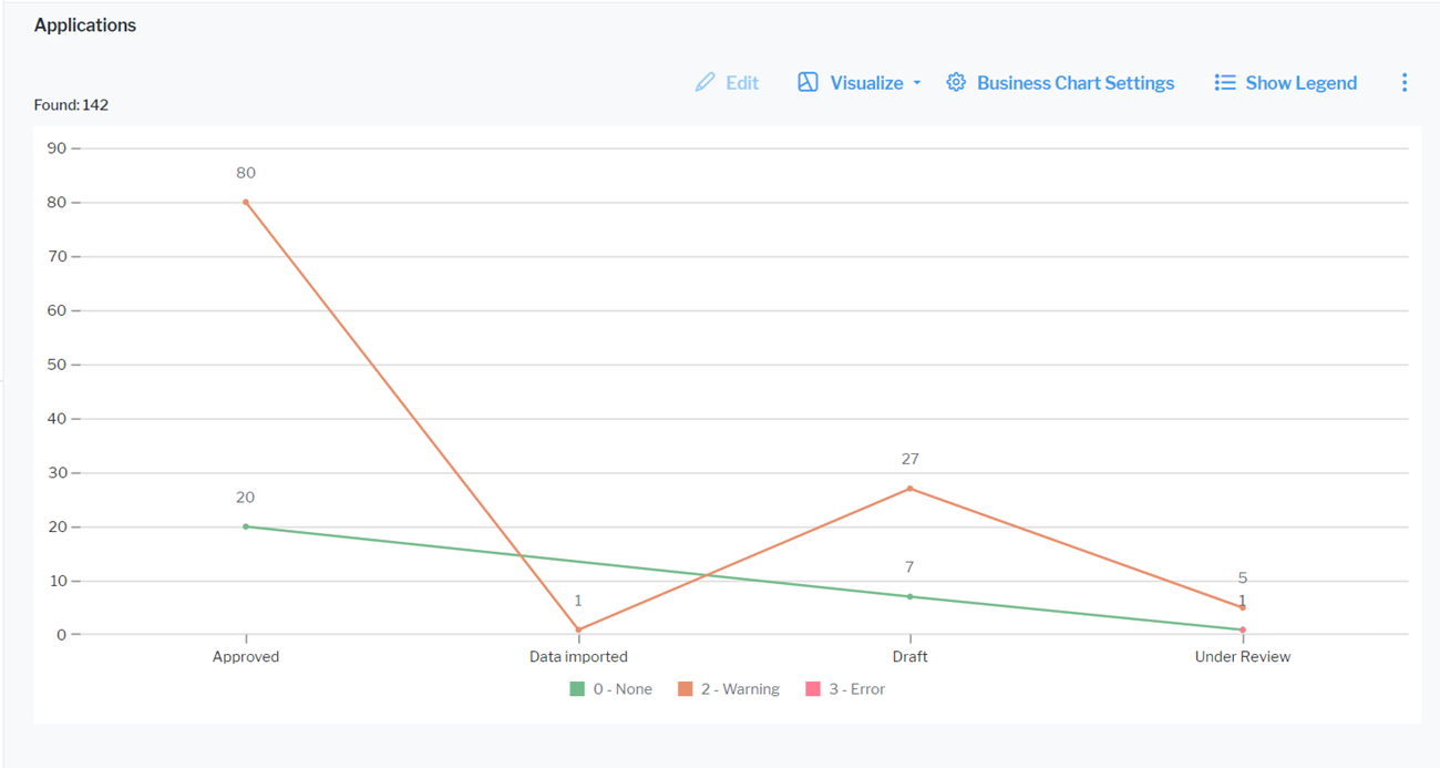
Click Visualize > Business Charts > Line Chart. Click Business Chart Settings to set up the line chart.
The assets visible in the visualization are based on the definition made in the data table. To add or remove assets, click Visualize > Data Table. Click the Structure button to change the content. Click to learn more about how to specify the data you want to see.
Define the data to display in the Data Visualization tab.
- X-Value: Select one or more attributes to show as the value on the X-axis.
- Y-Value: Select either <RecordCount> to show the total number of records or a different number value to display on the Y-axis.
- Series: Select one or more attributes to specify a data series to further distinguish the results based on a selected attribute. The series is represented by different lines in the line chart.
You can optionally change the layout in the Layout tab.
- Chart Title: Define a title for display on top of the chart.
- X-Axis Title: Define a title for display beneath the X-axis.
- Y-Axis Title: Define a title to display along the Y-axis.
- Hide Value Labels: Set a checkmark to hide value labels for the points on the lines. Value labels provide information about the number the point represents.
- Background Color: Select a color to change the color of the chart background.
- Number Prefix: Enter a prefix to display before the numerical value. For example, enter a currency symbol to add it in front of a monetary value in the value labels. There will be no white space between the prefix and the number.
- Y-Minimum Value: By default, the range of the Y-axis is adjusted to the maximum and minimum Y-values in the chart. Set this attribute to enforce a start point for the Y-axis. For example, define the same Y-axis range for multiple charts to make it easier to compare the values in the charts. If an Y-value in the chart is smaller than the selected minimum value, the minimum value setting will be ignored to ensure that all data is displayed.
- Y-Maximum Value: By default, the range of the Y-axis is adjusted to the maximum and minimum Y-values in the chart. Set this attribute to enforce an end point for the Y-axis. For example, define the same Y-axis range for multiple charts to make it easier to compare the values in the charts. If an Y-value in the chart is higher than the selected maximum value, the maximum value setting will be ignored to ensure that all data is displayed.
Set up the pie chart
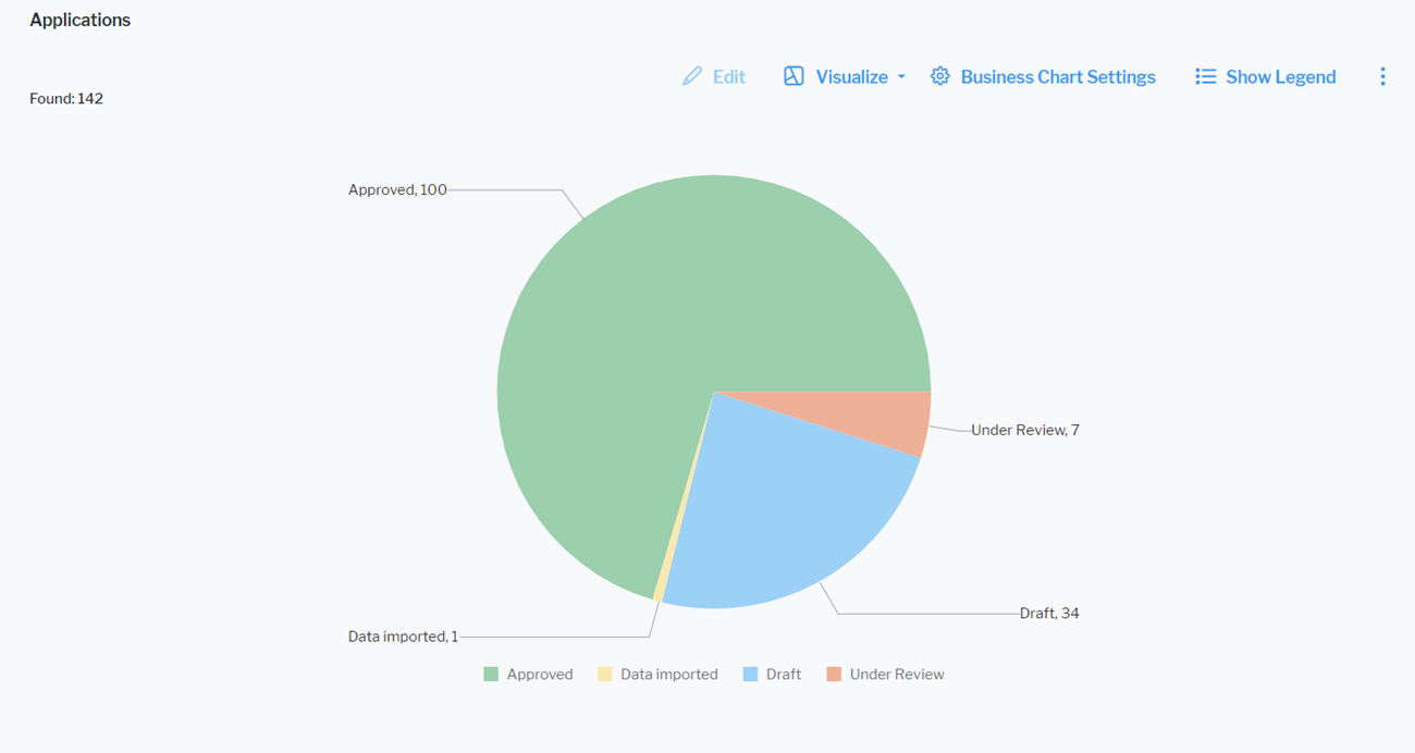
Click Visualize > Business Charts > Pie Chart. Click Business Chart Settings to set up the pie chart.
The assets visible in the visualization are based on the definition made in the data table. To add or remove assets, click Visualize > Data Table. Click the Structure button to change the content. Click to learn more about how to specify the data you want to see.
Define the data to display in the Data Visualization tab.
- X-Value: Select one or more attributes to show as sections in the pie chart.
- Y-Value: Select a numeric value that determines the size of each section in the pie chart. You can select either <RecordCount> to show the total number of records or a numeric attribute of the asset type.
You can optionally change the layout in the Layout tab.
- Chart Title: Define a title for display on top of the chart.
- Hide Value Labels: Set a checkmark to hide value labels on segments of the pie providing information about the number the segment represents.
- Number Prefix: Enter a prefix to display before the numerical value. For example, enter a currency symbol to add it in front of a monetary value in the value labels. There will be no white space between the prefix and the number.
Set up the radar chart
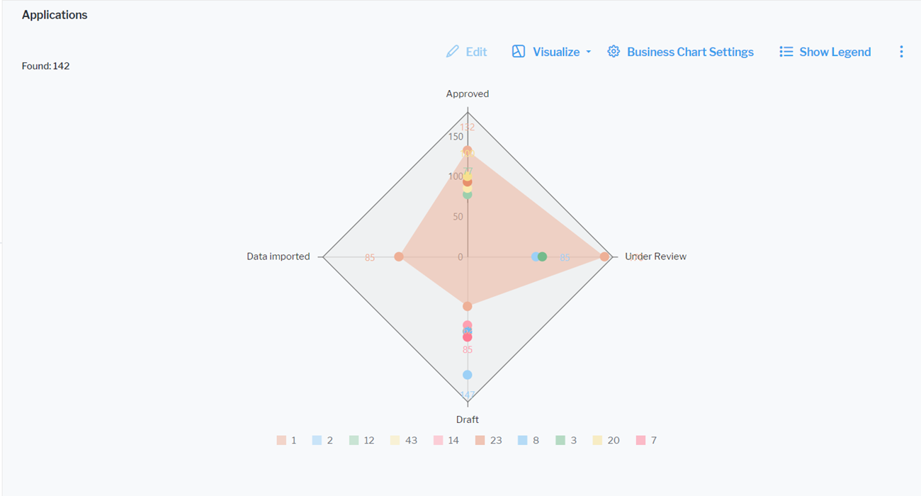
Click Visualize Data > Business Charts > Radar Chart. Click Business Chart Settings to set up the radar chart.
The assets visible in the visualization are based on the definition made in the data table. To add or remove assets, click Visualize > Data Table. Click the Structure button to change the content. Click to learn more about how to specify the data you want to see.
Define the data to display in the Data Visualization tab.
- X-Value: Select one or more attributes to show as the number of corners of the radar chart.
- Y-Value: Select either <RecordCount> to show the total number of records or a different number value. The number defines the distance from the center point on each corner of the radar chart.
- Series: Select one or more attributes to specify a data series to further distinguish the results based on a selected attribute. The series is represented by the color of the area span between the data points in the radius chart.
You can optionally change the layout in the Layout tab.
- Chart Title: Define a title for display on top of the chart.
- Hide Value Labels: Set a checkmark to hide value labels on data points in the chart. Value labels provide information about the number the value point represents.
- Number Prefix: Enter a prefix to display before the numerical value. For example, enter a currency symbol to add it in front of a monetary value in the value labels. There will be no white space between the prefix and the number.
Set up the doughnut chart
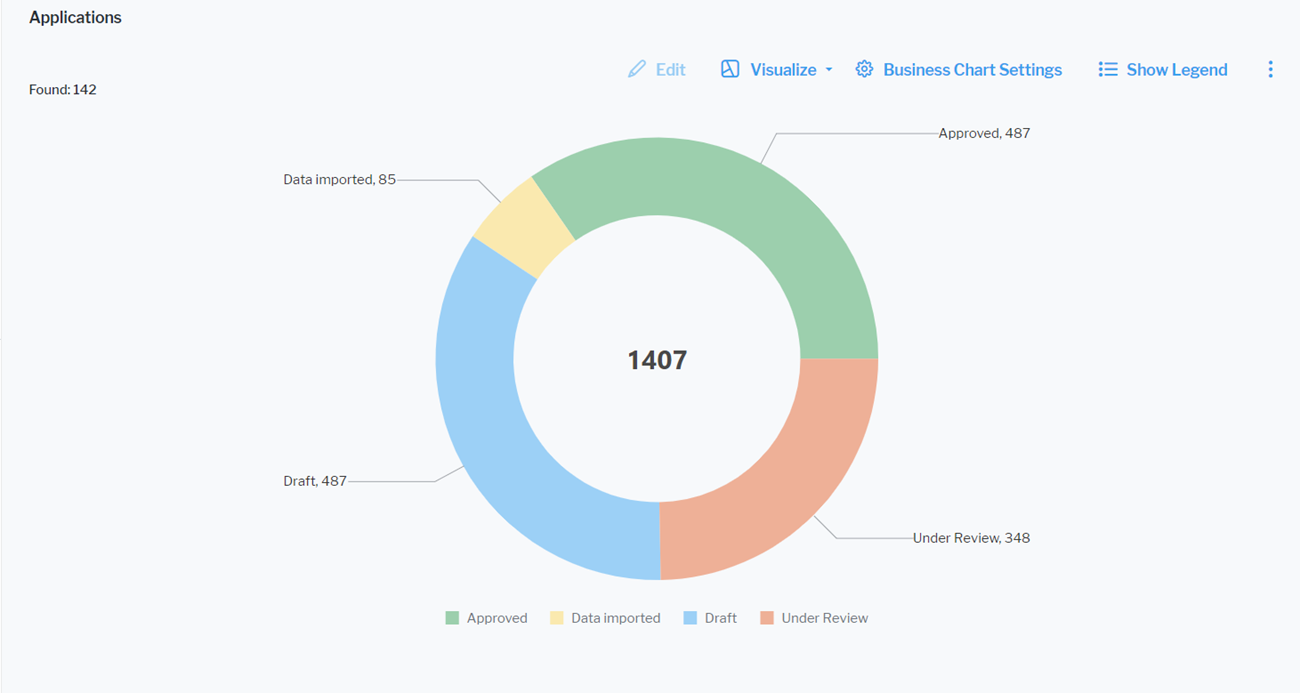
Click Visualize Data > Business Charts > Doughnut Chart. Click Business Chart Settings to set up the doughnut chart.
The assets visible in the visualization are based on the definition made in the data table. To add or remove assets, click Visualize > Data Table. Click the Structure button to change the content. Click to learn more about how to specify the data you want to see.
Define the data to display in the Data Visualization tab.
- X-Value: Select one or more attributes to show as sections in the doughnut chart.
- Y-Value: Select a numeric value that determines the size of each section in the doughnut chart. Select either <RecordCount> to show the total number of records or a numeric attribute of the asset type.
You can optionally change the layout in the Layout tab.
- Chart Title: Define a title for display on top of the chart.
- Show Sum of Values: Select the checkbox if you want the sum of all Y-values to be displayed in the center of the doughnut.
- Hide Value Labels: Set a checkmark to hide value labels on segments of the doughnut providing information about the number the segment represents.
- Number Prefix: Enter a prefix to display before the numerical value. For example, enter a currency symbol to add it in front of a monetary value in the value labels. There will be no white space between the prefix and the number.
Set up the board visualization
Board visualizations present portfolio data as cards arranged in user-defined columns, giving teams an immediate, intuitive view of task status, ownership, and upcoming work. Inspired by Kanban boards, they offer instant clarity, support effortless prioritization through drag-and-drop reordering, and strengthen collaboration by ensuring everyone sees the same information during shared decision-making processes such as application portfolio rationalization or strategic prioritization.
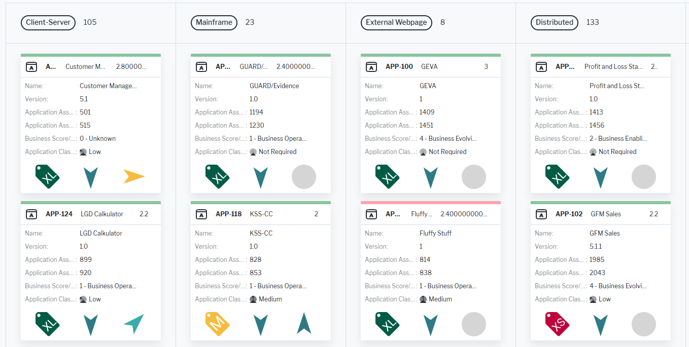
Cards can be colored based on enumeration values or indicator ranges and you can configure up to three attributes to appear in the card header, and display and order up to seven additional attributes and three icons within the card body.
A single click on any object or referenced object shown on a card opens it in the object inspection pane for preview and editing, while a double-click navigates directly to its content area. Cards can also be dragged between columns, automatically updating the object’s value associated with that column. Cards cannot be sorted within a column via the drag-and-drop functionality.
Click Visualize > Board Visualization.
The assets visible in the visualization are based on the definition made in the data table. To add or remove assets, click Visualize > Data Table. Click the Structure button to change the content. Click to learn more about how to specify the data you want to see.
- Expand or collapse the cards. Users can switch between expanded cards, which display full details, and collapsed cards for a more compact view. Click Expand All to show all details of a card. Click Collapse All to show the compact view with only the card header attributes displayed.
-
Define the board visualization settings. Click Board Settings to open the editor:
- Group By (Column Definition): Select one value to determine the columns to display. You can select a role (non-plural, filled by a single person or organization), release status, enumeration, reference-type property, or indicator with a range definition.
Grouping also acts as an additional filter. Assets with no value for the selected grouping attribute will not be displayed any longer in the board.
- Object Categorization/Coloring: Select an attribute that should be used to add color to the cards. Colors are only displayed if the attribute has background color style defined. Such attributes are also colored in the data table.
- Card header: Specify an optional class icon and up to 3 attributes to display in the header. If the cards are collapsed in the board, users will still see the card header.
- Show Class Icon: Select to add the class icon for the card's asset to the card header.
- First Attribute, Second Attribute, and Third Attribute: Select an attribute to display in the header.
- Group By (Column Definition): Select one value to determine the columns to display. You can select a role (non-plural, filled by a single person or organization), release status, enumeration, reference-type property, or indicator with a range definition.
-
Card Icons: Select up to 3 icons to show in the body of the card. Use the 6-dots buttons
 in the Card Icons list to order the icons in the card.
Set up the Gantt chart
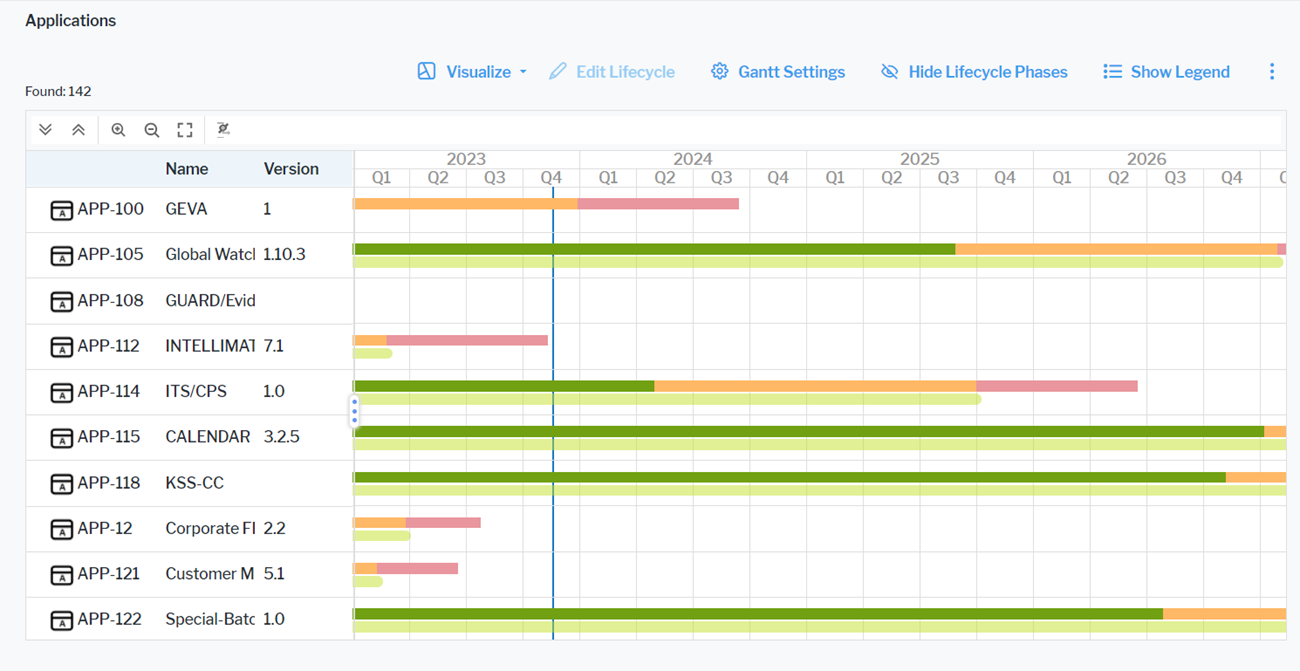
A Gantt chart is only meaningful for assets based on classes that have start and end dates, a lifecycle with lifecycle phases, or other date attributes.
Click Visualize > Gantt Chart. The Gantt chart displays assets on a timeline. If both start and end dates and lifecycle phases are defined, the timeline for start and end date is displayed beneath the timeline for the lifecycle phases.
The assets visible in the visualization are based on the definition made in the data table. To add or remove assets, click Visualize > Data Table. Click the Structure button to change the content. Click to learn more about how to specify the data you want to see.
- Show or hide lifecycle phases. Click Show Lifecycle Phases to show the timeline with the start and end dates of the asset and all of it's defined lifecycle phases. You can click Show Legend to understand the colors of the lifecycle phases. Click Hide Lifecycle Phases to show only the timeline with the asset's start and end dates.
-
Define the time schedule settings.:
- Calendar Unit: Specify whether to display the timeline in years, quarters, months, or weeks.
- Start with Current Year: Select if the current year shall be the start year of the Gantt chart. To focus on a different timeframe, define a specific start year in the Calendar Start Year and end year in the Calendar End Year fields.
-
Define the display of information about the assets.:
- Column Caption: Specify a caption for the column displaying the asset information.
- Object Attributes to Display: Select the attributes to display for the assets. You can either have each attribute displayed in its own column or select the Object Attributes in One Column checkbox to display them in only the first column.
If attributes are not displayed, they may be hidden because the field for the attributes is too small. Increase the size of the field to see all attributes.
- Attribute for Start Date and Attribute for End Date: Define the date attribute to use to determine the start and end dates of the bars in the Gantt chart.
- Relevant only for Gantt charts showing project data.: Show Enterprise Milestones: Set a checkmark to display project milestones. To create project milestones for a project, select a project to navigate and go to Monitoring > Project Milestones.
Set up the matrix report
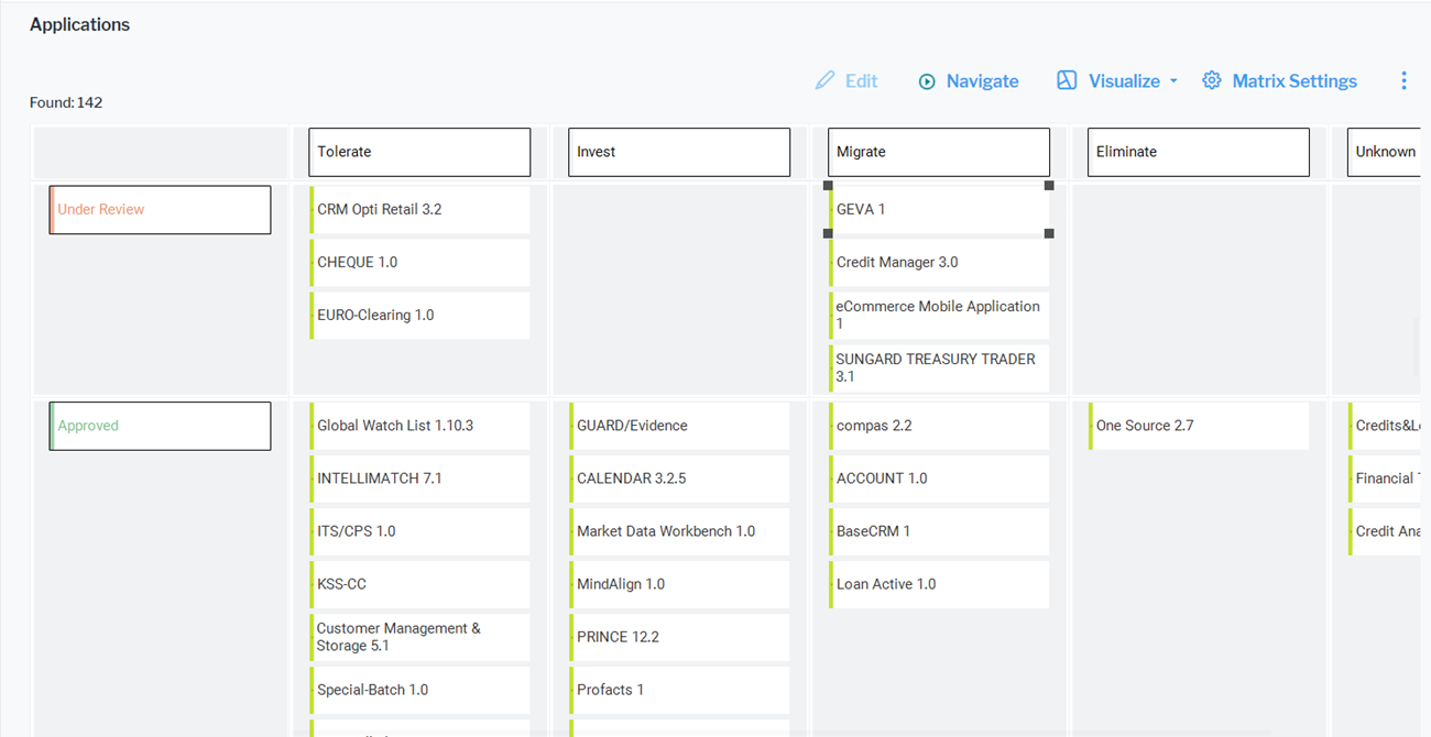
Click Visualize > Matrix Report. The following is possible in matrix reports:
The assets visible in the visualization are based on the definition made in the data table. To add or remove assets, click Visualize > Data Table. Click the Structure button to change the content. Click to learn more about how to specify the data you want to see.
-
Define the content of the matrix. Click Matrix Settings to design the matrix report.
- Visualize a matrix with one row only. Define the Column Definitionfield. A column is displayed for each value of the selected attribute.
If you select Status, then a column is added for each status value. If you select a role, a column will be created for each user assigned the role.
- Visualize a matrix with multiple rows. Define the Column Definition and Row Definition fields.
- The same value should not be defined in both fields.
- To remove the value for the row or column, select the empty row in the drop-down of the relevant field.
- You can only select references to other assets and attributes with a defined string range.
- Show information on the items. Select the attributes to show in the Item Definition field. It is recommended to only show a few attributes on the matrix items.
- Visualize a matrix with one row only. Define the Column Definitionfield. A column is displayed for each value of the selected attribute.
-
Edit values in the matrix. You can change the value for the attribute (or indicator, role, etc.) represented by the columns.
If Status is selected for the column definition, you can move an asset in the matrix from one column to another to change its status value.
- Assets that do not have a value defined for the selected attribute (or indicator, role, etc.) are displayed in the first column under an empty header. Move the asset to the appropriate column to specify the missing value.
If the role Architect is selected for the column definition, all assets that do not have the role Architect defined are displayed in the first column.
- Move an asset in the matrix via drag-and-drop to another column to easily redefine it. Assets can only be moved if the attributes specified for the corresponding column and row definitions are configured to have write access permissions.
While moving the asset, the object inspection panel might simultaneously open. You can still drag-and-drop the asset.
- Press CTRL+C to copy a selected asset to multiple columns. This is only possible if the attribute specified for the column definition supports multiple references. For example, an application can be assigned to multiple application groups or an application may be specified to have multiple users responsible for it via a role.
- Assets that do not have a value defined for the selected attribute (or indicator, role, etc.) are displayed in the first column under an empty header. Move the asset to the appropriate column to specify the missing value.
Set up the portfolio chart
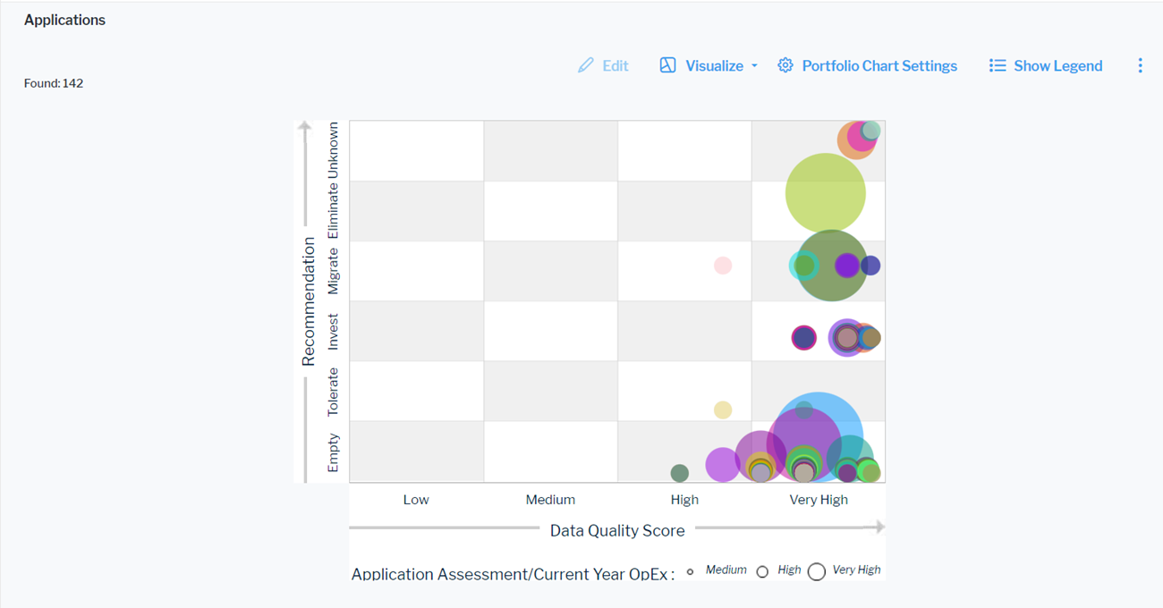
Click Visualize > Portfolio Chart. Click Portfolio Chart Settings to set up the portfolio chart.
The assets visible in the visualization are based on the definition made in the data table. To add or remove assets, click Visualize > Data Table. Click the Structure button to change the content. Click to learn more about how to specify the data you want to see.
- X-Value Column: Select an attribute to show as the value on the X-axis.
- Y-Value Column: Select an attribute as the value on the Y-axis.
- Z-Value Column: Select a numeric attribute to specify the size of the bubbles in the portfolio chart.
- Quadrant Layout: Select the checkbox if you want to display the portfolio in a quadrant layout except of a portfolio with value axes.
-
Quadrant Captions: If you have selected the Quadrant Layout checkbox, define the captions of the quadrants. Captions are separated by new lines. The definition starts with the upper captions followed by the lower captions from left to right:
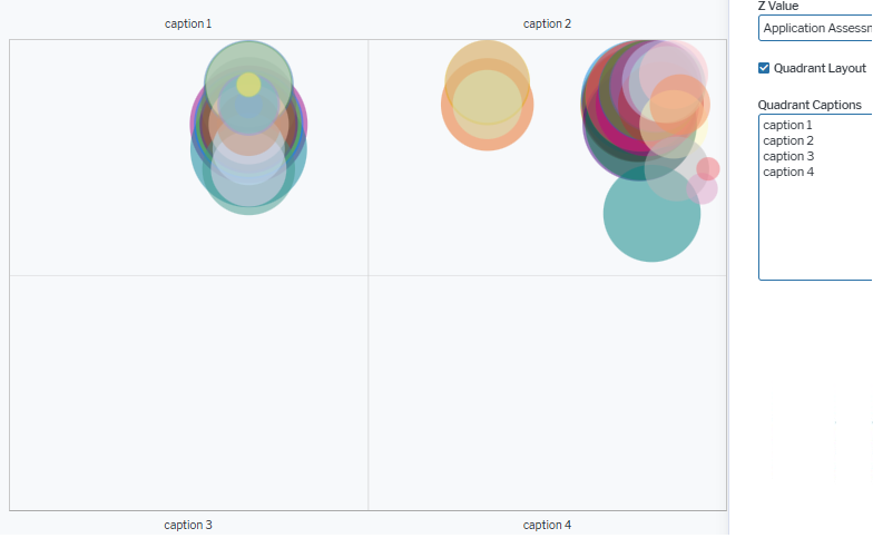
If you select an indicator with a range definition to be displayed on the x-axis or y-axis, the order of values from left to right or from bottom to top is identical to the order of values defined for the range of the indicator. The values may be sorted from lower to higher or higher to lower values, depending on the indicator definition.
Set up a card

Click Visualize > Card. Click Card Settings to set up the card.
The assets visible in the visualization are based on the definition made in the data table. To add or remove assets, click Visualize > Data Table. Click the Structure button to change the content. Click to learn more about how to specify the data you want to see.
- Card Template: Select the card template to display a card. Currently, only the Workbench Card card is available.
- Title: Define the heading to be displayed on top of the value in the card.
- Description: Enter a text if you want to display information below the value in the card.
- Value Color: Select a color for the number displayed in the card. Numbers are listed as Color Name (Color Group Name). These are the names defined for the color in the custom interface themes. If you select a different theme in your user settings, the color in your card might change.
- By default, the value displayed in the card is the number of records returned by your filter settings in the data table. Alternatively, you can change the view to display one of the following:
- You can display the number of records corresponding to an additional filter set in the card settings. Filtering is only available for attributes with a fixed set of allowed values. Select Records Count in the Grouping Operation field. Then select the attribute in the Grouping Operation Column field and the values that shall apply to the records counted in the card in the Grouping Filter field.
- You can display a value calculated based on a numeric attribute or an indicator. Select the type of result that shall be calculated in the Grouping Operation field. Then select the attribute in the Grouping Operation Column field.
- To configure display of a unit symbol or text behind the number, select one of the available unit definitions in the Measurement Unit field or select the Use Default Currency as Measurement Unit checkbox to display the symbol of the default currency of the Alfabet application.