Define colors for cards
Cards are a representation of indicator values or calculated numbers for display in content areas.
All cards are based on widget card templates defined in Alfabet Expand. Widget card templates defined in Alfabet Expand can be used by administrative users to display multiple indicators of an evaluation type or a single indicator. In addition, users can define cards as visualization of content in the data workbench. A user can store the card in the content repository and add it to a content area.
You can base coloring of text for the cards on style group definitions in the definition of the widget card template. Users can also select colors for values in cards from style groups.
Widget card definitions are based on Microsoft® adaptive cards. Color values in the Microsoft adaptive card can be defined as binding expressions, which are a Microsoft adaptive card specific variable. In Alfabet Expand, the variable value is specified in the widget card template. You can define a specific color to be used for rendering the card or base the coloring on styles. The selector for assigning a style to a variable definition in the widget card template shows styles from any style group. As a best practice, create a style group containing widget card template styles only.
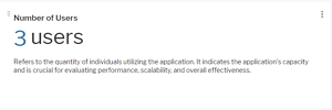
A widget card template is defined which is having a binding expression for a color setting.
- Go to the Reusable Elements tab.
- Right-click the User Interface Groups node and select Create New Style Group.
- Click the new style group node and set the attributes:
- Name: Change the name to a meaningful name for display in the style selector in Alfabet Expand.
- Caption: Change the caption to a meaningful caption for display in the Alfabet user interface in the views to edit the coloring for a new custom theme.
- Type: Select Custom.
- For each color you want to use in a widget card template, you need to create a separate style with one style attribute:
- Right-click the style group node and select Create Style.
- Click the new style node and change the Name and Caption attributes to help the person configuring the widget card templates to select the correct color.
- Right-click the style node in the explorer and select Create Style Attribute.
- Click the style attribute node and set the attributes:
- Name: Change the name to a meaningful name for display in the style selector in Alfabet Expand.
- Caption: Change the caption to a meaningful caption for display in the Alfabet user interface in the views to edit the coloring for a new custom theme.
- Description: Change the caption to a meaningful caption for display in the Alfabet user interface in the views to edit the coloring for a new custom theme.
- Type: Select Color.
- Default Value: Select a color from the color picker.
- Go to the Presentation tab.
- Expand the Widgets node and expand the node of the widget card template you want to color.
- Click the node of the color variable and set the following attributes:
- Mapping Type: Color.
- Type: Common.
- User Interface Item: Select the user interface style which shall be used for the text. The drop-down list includes all available styles with a text color specification with the information: style name (user interface group name).
- Value: Leave this field empty.
Styles can be selected by users to color the number in a card. In data workbenches, coloring via a style in a style group is part of the card settings for the card visualization. In the definition of evaluation types and indicator types, coloring based on styles is part of the widget definition for the indicator type or evaluation type.
The style groups defined for coloring of user defined card definitions require a special setting. They can have one or multiple style definitions. Users defining cards for data workbenches can only select one of the styles of any of the style groups. Administrative users defining cards for an indicator type or an evaluation type can also define coloring dependent on the current value. They can select a style group and define value ranges for each style. A style group can be used for multiple cards and the styles can have a different range definition in each card.
- Go to the Reusable Elements tab.
- Right-click the User Interface Groups node and select Create New Style Group.
- Click the new style group node and set the attributes:
- Name: Change the name to a meaningful name for display in the explorer in Alfabet Expand.
- Caption: Change the caption to a meaningful caption for display in the Alfabet user interface. The caption will be displayed to administrative users defining indicator cards, in the card settings view of data workbenches, and in the views to edit the coloring for a new custom theme.
- Type: Select Indicator.
- For each style that shall be available in the card, do the following:
- Right-click the style group node and select Create Style.
- Click the new style node and change the Name and Caption attributes to a meaningful information for the user. For card styles, it is useful for the user to be informed by the caption about the color applied by the style.
- Expand the style node, click the Color child node and set the Default Color attribute to the text color to be used in cards. Define a Caption and Description for the color. Caption and Description are displayed to administrative users changing colors for color themes on the Alfabet user interface to inform about the purpose of the color.
The Background Color attribute is currently not used.