Add default content to content pages
The content you add to the content page is the default content that will be directly visible to all users accessing the content area for the first time. In addition, users will have by default access to content you added to the default content repository via the Manage Content on Page functionality of the content area. Users can then add content to the content repository and add, remove and restructure the default content specified by you as default.
You can start your content area definition with the definition of a content repository, adding all content items including the content items that shall be directly visible in the default configuration of the content area. You can then use the functionality for designing the layout of the content area in the web-based content area designer to define all content pages directly in the web-based content area designer.
You can add any of the following items:
-
Property Groups: Only for class-based content areas. Property groups list all object class properties of the current object class assigned to them. Object class properties are assigned to object class property groups in the class settings of the object class.
Users can edit the object class properties in a property group if they have ReadWrite access permissions for the current object and the current user profile does not exclude inline editing for the object class property. The editability of object class properties is defined in the class settings of the object class.
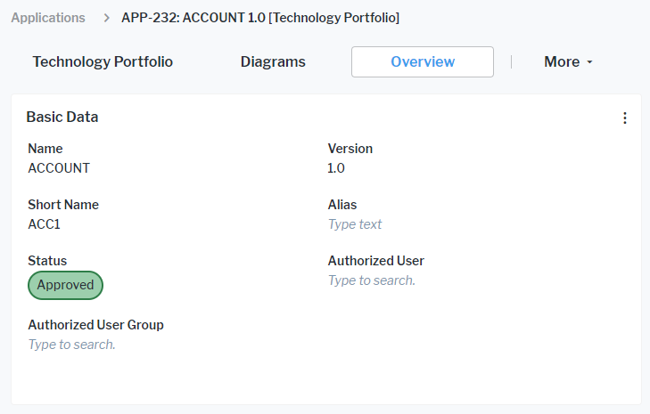
- Data Workbenches: Data workbenches provide inline editing capabilities for the objects of an object class. Users can edit the object class properties in a data workbench if they have ReadWrite access permissions for the object and the current user profile does not exclude inline editing for the object class property. The editability of object class properties is defined in the class settings of the object class. In addition, users can create their own reports based on data in a data workbench.
-
Standard Views and Configured Reports: Standard views for Alfabet are provided with the standard, private meta-model. They provide either graphic reports or tabular views on data without inline editing capabilities. The user must open the editor or wizard to edit an object.
Configured reports are created by solution administrators in Alfabet Expand. They provide either graphic or tabular visualizations of data. Only a limited number of configured reports have editing capabilities.
If you would like to add a tabular view for editing of objects, please check whether it is possible to use a data workbench instead of a standard view or configured report. The aim should be to avoid standard views. They do not provide inline editing capabilities.
-
Cards: Cards represent indicators or numeric data. Cards with numeric data can only be created by end users in data workbenches. They can only be added to content areas by the end user who has created them. Indicator cards are created by administrative users on the Alfabet user interface as part of the evaluation type configuration. They can be added to content areas as default items in Alfabet Expand. There are two types of cards for evaluation data:
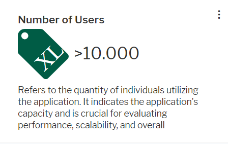
Indicator cards show indicators as big numbers with a heading, an optional description, and an optional image.
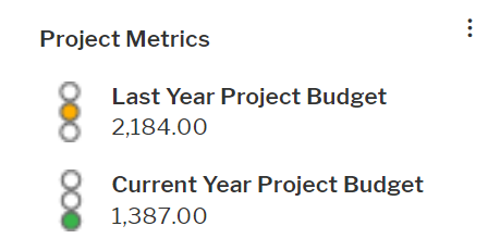
Grouped indicator cards show multiple indicators from the same evaluation type with an icon and the value.
-
Standard Views and Configured Reports: Standard views for Alfabet are provided with the standard, private meta-model. They provide either graphic reports or tabular views on data without inline editing capabilities. The user must open the editor or wizard to edit an object.
Configured reports are created by solution administrators in Alfabet Expand. They provide either graphic or tabular visualizations of data. Only a limited number of configured reports have editing capabilities.
If you would like to add a tabular view for editing of objects, please check whether it is possible to use a data workbench instead of a standard view or configured report. The aim should be to avoid standard views. They do not provide inline editing capabilities.
- Business Functions: for Alfabet are provided with the standard, private meta-model and provide access to standard views or explorers. In addition, customer defined explorers might be available in the meta-model as business functions. Business functions cannot be displayed directly in content areas. You can either define an image or a view that shall be displayed as placeholder. Users can click the title of the content item to access the business function.
- Content Areas: You can add content areas to content areas, for example to link from the Home content area to different content areas providing task related collections of views and functionality. Content areas cannot be displayed directly in content areas. You can either define an image or a view that shall be displayed as placeholder. Users can click the title of the content item to access the content area.
-
Categorized Visual Items: A categorized visual item is a content area independent definition of a content item for either a graphic view, configured report, content area, data workbench, or business function. The categorized visual item provides a link to the content assigned to it. The content is hidden behind a description of what the user will see when clicking the content item title. Depending on your configuration of the categorized visual item, the user can see a title, a description, an icon, and assignments to categories in the categorized visual item. The coloring can be defined per category the categorized visual item belongs to.

- External URL content: Views from external web-based applications and web sites can be embedded read-only to a content area as a content item.
Users can not only view the content but also use filter and editing capabilities. They can click on the title of content items to change to a full view of the content item. This navigation is not provided for property groups. For cards, navigation depends on the configuration of the card.
You can show an image or a configured report as a placeholder for the actual content of the item. This is required for adding content areas and business functions to content areas. It is optional for configured reports, standard views, data workbenches and indicator cards. You can alternatively add the content to a categorized visual item to define a placeholder description text, icon, and categorization.
-
- The content area is a class-based content area.
- You have defined the content of the property group:
- You can add object class properties via the class settings for the object class the class-based content area is designed for.
- You can add roles via a setting in the class configuration editor for role types.
- You can add indicators via a setting in the editor of the indicator type. This is recommended for indicators set by users. You should add calculated indicators via cards. Cards provide better visibility and a button for indicator recalculation.
- You can add extended attributes via a setting in the editor of the extended attribute.
- Right-click the content page node in the explorer and select Add Property Group Item.
- Select a property group in the selector.
- Optionally click the new property group item node and define the attributes:
- Caption: Define the caption of the property group in the content area item. By default, the caption of the property group is displayed.
- Base Object Query: Optionally, you can define a query to determine a base object for the content item that is different from the base object of the content area.
You cannot add an object class property group two times to a content page. If you want to add object class property groups with a changed base object, the object class properties of the two objects for which content is available on the page must be in different object class property groups.
- Sort Grouped Properties: Open the editor. Select an item in the list and change its position with the arrow buttons on the right or sort the content lexicographically.
In the class settings, object class property assignement to property groups can be overwritten. It is recommended to perform sorting of properties in a property group in the class settings instead of the content area configuration to include class setting related changes.
- Load on Update: Data about an object can be displayed and edited in multiple content items of the same content area page. If a user changes the data in one content item, by default, the other content items are not re-loaded to update their data. You can change the default behavior for individual content items. Set Load on Update to True if you want the content item to be re-loaded each time a user edits any data within the same page of the content area.
Reload of content items can slow loading of content areas considerably. Only set this attribute to True if the content item shows critical data that is editable on the same content area page.
- Recalculate Indicators on Load: Set this attribute to True if you added indicators to the object class property group and want all indicators in the object class property group to be recalculated when the object is changed or the content area page or guided data view for the object is loaded. This setting triggers indicator recalculation only. You must also set the Load on Update property to True to display the re-calculated indicator value in the object class property group after recalculation. Recalculation is always done prior to re-load.
Recalculation of indicators with complex computation rules can lead to performance issues. Users can any time update the indicators in the object class property group manually via button interaction independent from automatic recalculation.
- Width and Height: You can change the default width and height to enlarge the property group. A better method for re-sizing is available directly via the web-based content area designer.
- Default Visibility: Set the attribute to Hidden if the content item shall not be visible directly in the content page but only available via the content repository.
For customers migrating from Alfabet 11.8 to Alfabet 11.10 the attribute will be set to Hidden for content pages which were in Alfabet 11.8 available in the configuration in Alfabet Expand but hidden in the default configuration.
- Visibility Conditions: If you want the content item to be only visible under specific circumstances, you can define a condition element testing whether the specific circumstances apply. You can then select the condition element in this attribute. The content item will be visible if the condition applies. For example, a condition specifies that the content item shall only be visible for users in user group B. The condition checks the user group configuration for the current user at runtime and hides the content item if the user is not a member of user group B.
-
- Right-click the content page node in the explorer and select Add Graphic View Item.
- Select a graphic view in the selector.
For class-based content areas the view which you select shall display data for an object of the current object class. For class-independent content areas, the graphic view shall not depend on a base object the user current works with.
- Optionally click the new graphic view item node and define the attributes:
- Caption: Define the caption of the standard view in the content area item. By default, the caption of the standard view is displayed.
- Base Object Query: Optionally, you can define a query to determine a base object for the content item that is different from the base object of the content area.
- Load on Update: Data about an object can be displayed and edited in multiple content items of the same content area page. If a user changes the data in one content item, by default, the other content items are not re-loaded to update their data. You can change the default behavior for individual content items. Set Load on Update to True if you want the content item to be re-loaded each time a user edits any data within the same page of the content area.
Reload of content items can slow loading of content areas considerably. Only set this attribute to True if the content item shows critical data that is editable on the same content area page.
- Width and Height: You can change the default width and height to enlarge the standard view content item. A better method for re-sizing is available directly via the web-based content area designer.
- Default Visibility:Set the attribute to Hidden if the content item shall not be visible directly in the content page but only available via the content repository.
For customers migrating from Alfabet 11.8 to Alfabet 11.10 the attribute will be set to Hidden for content pages which were in Alfabet 11.8 available in the configuration in Alfabet Expand but hidden in the default configuration.
- Visibility Conditions: Visibility Conditions: If you want the content item to be only visible under specific circumstances, you can define a condition element testing whether the specific circumstances apply. You can then select the condition element in this attribute. The content item will be visible if the condition applies. For example, a condition specifies that the content item shall only be visible for users in user group B. The condition checks the user group configuration for the current user at runtime and hides the content item if the user is not a member of user group B.
- Background color: Select a color from the color picker if you want to display the content item with another color than the white default color.
- Foreground color: Select a color from the color picker if you want to display the caption of the content item in another color than the black default color.
- Item preview image: If you select a preview image, the image is displayed in the content item beneath the caption and the user must click the caption to view the standard view. Open the editor. First select the icon gallery the icon is assigned to, then select the icon from the list of icons in the icon gallery.
- Item preview image color Style Group / Item preview image color Style: If you selected an SVG image in the Item preview image attribute, you could configure the SVG to change the color dependent on the custom theme a user selected for coloring the user interface. Click for an overview of the definition of color themes. Select the style group for coloring the SVG image in the Item preview image color Style Group attribute and the style in the Item preview image color Style attribute.
- Item preview report: If you select a preview report, the preview report is displayed in the content item beneath the caption and the user must click the caption to view the standard view. Select a configured report that shall be displayed instead of the standard view from the list.
-
- You have created a configured report. For class-based content areas, the configured report must be assigned to the object class the content area is about and refer to the base object in the query the report is based on with an Alfabet parameter @BASE. For class-independent content areas, the configured report must be independent from a base object class.
- Right-click the content page node in the explorer and select Add Report Item.
- Select the configured report in the selector.
- Optionally click the new report item node and define the attributes:
- Caption: Define the caption of the configured report in the content area item. By default, the caption of the configured report is displayed.
- Base Object Query: Optionally, you can define a query to determine a base object for the content item that is different from the base object of the content area.
- Load on Update: Data about an object can be displayed and edited in multiple content items of the same content area page. If a user changes the data in one content item, by default, the other content items are not re-loaded to update their data. You can change the default behavior for individual content items. Set Load on Update to True if you want the content item to be re-loaded each time a user edits any data within the same page of the content area.
Reload of content items can slow loading of content areas considerably. Only set this attribute to True if the content item shows critical data that is editable on the same content area page.
- Width and Height: You can change the default width and height to enlarge the report content item. A better method for re-sizing is available directly via the web-based content area designer.
- Default Visibility:Set the attribute to Hidden if the content item shall not be visible directly in the content page but only available via the content repository.
For customers migrating from Alfabet 11.8 to Alfabet 11.10 the attribute will be set to Hidden for content pages which were in Alfabet 11.8 available in the configuration in Alfabet Expand but hidden in the default configuration.
- Visibility Conditions: Visibility Conditions: If you want the content item to be only visible under specific circumstances, you can define a condition element testing whether the specific circumstances apply. You can then select the condition element in this attribute. The content item will be visible if the condition applies. For example, a condition specifies that the content item shall only be visible for users in user group B. The condition checks the user group configuration for the current user at runtime and hides the content item if the user is not a member of user group B.
- Background color: Select a color from the color picker if you want to display the content item with another color than the white default color.
- Foreground color: Select a color from the color picker if you want to display the caption of the content item in another color than the black default color.
- Item preview image: If you select a preview image, the image is displayed in the content item beneath the caption and the user must click the caption to view the configured report. Open the editor. First select the icon gallery the icon is assigned to, then select the icon from the list of icons in the icon gallery.
- Item preview image color Style Group / Item preview image color Style: If you selected an SVG image in the Item preview image attribute, you could configure the SVG to change the color dependent on the custom theme a user selected for coloring the user interface. Click for an overview of the definition of color themes. Select the style group for coloring the SVG image in the Item preview image color Style Group attribute and the style in the Item preview image color Style attribute.
- Item preview report: If you select a preview report, the preview report is displayed in the content item beneath the caption and the user must click the caption to view the configured report. Select a configured report that shall be displayed instead of the configured report added with the content item from the list.
For example, you would like to add a Gantt report to a class-based content area so that the user can streamline lifecycle phases of information flows with the lifecycle of applications. You can define a preview report displaying a pie chart providing information about how many information flows of the application are in which lifecycle phase to provide a better overview of whether action is required. When the user clicks the caption, the Gantt chart opens.
You can either define an item preview report or an item preview image. If you define both, the item preview image will supersede the item preview report.
-
- You have created a data workbench. For class-based content areas, the data workbench must refer to the object class the content area is about as base class with an Alfabet parameter @BASE in the query it is based on. For class-independent content areas, the data workbench must be independent from a base object class.
- Right-click the content page node in the explorer and select Add Data Workbench Item.
- Select the data workbench in the selector.
- Optionally click the new data workbench item node and define the attributes:
- Caption: Define the caption of the data workbench in the content area item. By default, the caption of the data workbench is displayed.
- Base Object Query: Optionally, you can define a query to determine a base object for the content item that is different from the base object of the content area.
- Load on Update: Data about an object can be displayed and edited in multiple content items of the same content area page. If a user changes the data in one content item, by default, the other content items are not re-loaded to update their data. You can change the default behavior for individual content items. Set Load on Update to True if you want the content item to be re-loaded each time a user edits any data within the same page of the content area.
Reload of content items can slow loading of content areas considerably. Only set this attribute to True if the content item shows critical data that is editable on the same content area page.
- Width and Height: You can change the default width and height to enlarge the data workbench item. A better method for re-sizing is available directly via the web-based content area designer.
- Default Visibility:Set the attribute to Hidden if the content item shall not be visible directly in the content page but only available via the content repository.
For customers migrating from Alfabet 11.8 to Alfabet 11.10 the attribute will be set to Hidden for content pages which were in Alfabet 11.8 available in the configuration in Alfabet Expand but hidden in the default configuration.
- Visibility Conditions: Visibility Conditions: If you want the content item to be only visible under specific circumstances, you can define a condition element testing whether the specific circumstances apply. You can then select the condition element in this attribute. The content item will be visible if the condition applies. For example, a condition specifies that the content item shall only be visible for users in user group B. The condition checks the user group configuration for the current user at runtime and hides the content item if the user is not a member of user group B.
- Background color: Select a color from the color picker if you want to display the content item with another color than the white default color.
- Foreground color: Select a color from the color picker if you want to display the caption of the content item in another color than the black default color.
- Item preview image: If you select a preview image, the image is displayed in the content item beneath the caption and the user must click the caption to view the data workbench. Open the editor. First select the icon gallery the icon is assigned to, then select the icon from the list of icons in the icon gallery.
- Item preview image color Style Group / Item preview image color Style: If you selected an SVG image in the Item preview image attribute, you could configure the SVG to change the color dependent on the custom theme a user selected for coloring the user interface. Click for an overview of the definition of color themes. Select the style group for coloring the SVG image in the Item preview image color Style Group attribute and the style in the Item preview image color Style attribute.
- Item preview report: If you select a preview report, the preview report is displayed in the content item beneath the caption and the user must click the caption to view the data workbench. Select a configured report that shall be displayed instead of the data workbench from the list. You can either define an item preview report or an item preview image. If you define both, the item preview image will supersede the item preview report.
-
- You have defined a content area that can be linked to the current one. Only class independent content areas can be added to class independent content areas. If you add a content area to a class-based content area, the content area should be defined for the current object as base object.
- Right-click the content page node in the explorer and select Add Content Area Item.
- Select the content area in the selector.
- Click the new content area content item node and define the attributes.
The definition of either an Item preview image or an Item preview report is mandatory.
- Caption: Define the caption of the content area in the content area item. By default, the caption of the content area is displayed.
- Base Object Query: Optionally, you can define a query to determine a base object for the content item that is different from the base object of the content area.
- Load on Update: Data about an object can be displayed and edited in multiple content items of the same content area page. If a user changes the data in one content item, by default, the other content items are not re-loaded to update their data. You can change the default behavior for individual content items. Set Load on Update to True if you want the content item to be re-loaded each time a user edits any data within the same page of the content area.
Reload of content items can slow loading of content areas considerably. Only set this attribute to True if the content item shows critical data that is editable on the same content area page.
- Default Visibility:Set the attribute to Hidden if the content item shall not be visible directly in the content page but only available via the content repository.
For customers migrating from Alfabet 11.8 to Alfabet 11.10 the attribute will be set to Hidden for content pages which were in Alfabet 11.8 available in the configuration in Alfabet Expand but hidden in the default configuration.
- Visibility Conditions: Visibility Conditions: If you want the content item to be only visible under specific circumstances, you can define a condition element testing whether the specific circumstances apply. You can then select the condition element in this attribute. The content item will be visible if the condition applies. For example, a condition specifies that the content item shall only be visible for users in user group B. The condition checks the user group configuration for the current user at runtime and hides the content item if the user is not a member of user group B.
- Background color: Select a color from the color picker if you want to display the content item with another color than the white default color.
- Foreground color: Select a color from the color picker if you want to display the caption of the content item in another color than the black default color.
- Item preview image: If you select a preview image, the image is displayed in the content item beneath the caption and the user must click the caption to view the content area. Open the editor. First select the icon gallery the icon is assigned to, then select the icon from the list of icons in the icon gallery.
- Item preview image color Style Group / Item preview image color Style: If you selected an SVG image in the Item preview image attribute, you could configure the SVG to change the color dependent on the custom theme a user selected for coloring the user interface. Click for an overview of the definition of color themes. Select the style group for coloring the SVG image in the Item preview image color Style Group attribute and the style in the Item preview image color Style attribute.
- Item preview report: If you select a preview report, the preview report is displayed in the content item beneath the caption and the user must click the caption to view the content area. Select a configured report that shall be displayed instead of the content area from the list. You can either define an item preview report or an item preview image. If you define both, the item preview image will supersede the item preview report. The definition of either a preview image or a preview report is mandatory for content area items.
-
- You have defined the indicator card as an administrative user on the Alfabet user interface. Click here for information about how to define a grouped indicator card.
- Right-click the content page node in the explorer and select Add Indicator Item.
- Select the indicator card in the selector.
- Optionally click the new indicator item node and define the attributes:
- Width and Height: You can change the default width and height to enlarge the data workbench item. A better method for re-sizing is available directly via the web-based content area designer.
- Load on Update: Do not re-set this attribute. This kind of re-load mechanism does not update the indicator data in the content item and should therefore not be activated.
- Recalculate Indicators on Load: For indicator card items added to class-based content areas only. Set this attribute to True if you the indicator in the indicator card to be recalculated when the object is changed or the content area page or guided data view for the object is loaded. This setting triggers indicator recalculation only. You must also set the Load on Update property to True to display the re-calculated indicator value in the indicator card after recalculation. Recalculation is always done prior to re-load.
Recalculation of indicators with complex computation rules can lead to performance issues. Users can any time update the indicators in the card manually via button interaction independent from automatic recalculation.
- Default Visibility: Set the attribute to Hidden if the content item shall not be visible directly in the content page but only available via the content repository.
For customers migrating from Alfabet 11.8 to Alfabet 11.10 the attribute will be set to Hidden for content pages which were in Alfabet 11.8 available in the configuration in Alfabet Expand but hidden in the default configuration.
- Visibility Conditions: Visibility Conditions: If you want the content item to be only visible under specific circumstances, you can define a condition element testing whether the specific circumstances apply. You can then select the condition element in this attribute. The content item will be visible if the condition applies. For example, a condition specifies that the content item shall only be visible for users in user group B. The condition checks the user group configuration for the current user at runtime and hides the content item if the user is not a member of user group B.
- Base Object Query: This attribute cannot be set for indicator card content items.
-
- You have defined a card for an evaluation type as an administrative user on the Alfabet user interface. Click here for information about how to define a grouped indicator card.
- Right-click the content page node in the explorer and select Add Evaluation Item.
- Select a grouped indicator card in the selector.
- Optionally click the evaluation item node and define the attributes:
- Width and Height: You can change the default width and height to enlarge the property group. A better method for re-sizing is available directly via the web-based content area designer.
- Load on Update: Do not re-set this attribute. This kind of re-load mechanism does not update the indicator data in the content item and should therefore not be activated.
- Recalculate Indicators on Load: For grouped indicator card items added to class-based content areas only. Set this attribute to True if you the indicator in the grouped indicator card to be recalculated when the object is changed or the content area page or guided data view for the object is loaded. This setting triggers indicator recalculation only. You must also set the Load on Update property to True to display the re-calculated indicator value in the indicator card after recalculation. Recalculation is always done prior to re-load.
Recalculation of indicators with complex computation rules can lead to performance issues. Users can any time update the indicators in the card manually via button interaction independent from automatic recalculation.
- Default Visibility:Set the attribute to Hidden if the content item shall not be visible directly in the content page but only available via the content repository.
For customers migrating from Alfabet 11.8 to Alfabet 11.10 the attribute will be set to Hidden for content pages which were in Alfabet 11.8 available in the configuration in Alfabet Expand but hidden in the default configuration.
- Visibility Conditions: Visibility Conditions: If you want the content item to be only visible under specific circumstances, you can define a condition element testing whether the specific circumstances apply. You can then select the condition element in this attribute. The content item will be visible if the condition applies. For example, a condition specifies that the content item shall only be visible for users in user group B. The condition checks the user group configuration for the current user at runtime and hides the content item if the user is not a member of user group B.
- Load on Update: Do not re-set this attribute. This kind of re-load mechanism does not update the indicator data in the content item and should therefore not be activated.
- Base Object Query: This attribute cannot be set for indicator card content items.
-
- Right-click the content page node in the explorer and select Add Business Function Item.
- Select the business function in the selector.
- Click the new business function content item node and define the attributes.
The definition of either an Item preview image or an Item preview report is mandatory.
- Caption: Define the caption of the business function in the business function item. By default, the caption of the business function is displayed.
- Load on Update: Data about an object can be displayed and edited in multiple content items of the same content area page. If a user changes the data in one content item, by default, the other content items are not re-loaded to update their data. You can change the default behavior for individual content items. Set Load on Update to True if you want the content item to be re-loaded each time a user edits any data within the same page of the content area.
Reload of content items can slow loading of content areas considerably. Only set this attribute to True if the content item shows critical data that is editable on the same content area page.
- Width and Height: You can change the default width and height to enlarge the business funciton item. A better method for re-sizing is available directly via the web-based content area designer.
- Default Visibility:Set the attribute to Hidden if the content item shall not be visible directly in the content page but only available via the content repository.
For customers migrating from Alfabet 11.8 to Alfabet 11.10 the attribute will be set to Hidden for content pages which were in Alfabet 11.8 available in the configuration in Alfabet Expand but hidden in the default configuration.
- Visibility Conditions: Visibility Conditions: If you want the content item to be only visible under specific circumstances, you can define a condition element testing whether the specific circumstances apply. You can then select the condition element in this attribute. The content item will be visible if the condition applies. For example, a condition specifies that the content item shall only be visible for users in user group B. The condition checks the user group configuration for the current user at runtime and hides the content item if the user is not a member of user group B.
- Background color: Select a color from the color picker if you want to display the content item with another color than the white default color.
- Foreground color: Select a color from the color picker if you want to display the caption of the content item in another color than the black default color.
- Item preview image: If you select a preview image, the image is displayed in the content item beneath the caption and the user must click the caption to view the business function. Open the editor. First select the icon gallery the icon is assigned to, then select the icon from the list of icons in the icon gallery.
- Item preview image color Style Group / Item preview image color Style: If you selected an SVG image in the Item preview image attribute, you could configure the SVG to change the color dependent on the custom theme a user selected for coloring the user interface. Click for an overview of the definition of color themes. Select the style group for coloring the SVG image in the Item preview image color Style Group attribute and the style in the Item preview image color Style attribute.
- Item preview report: If you select a preview report, the preview report is displayed in the content item beneath the caption and the user must click the caption to view the business function. Select a configured report that shall be displayed instead of the business function from the list. You can either define an item preview report or an item preview image. If you define both, the item preview image will supersede the item preview report. The definition of either a preview image or a preview report is mandatory for business function items.
- Base Object Query: This attribute cannot be set for business function content items.
-
- Right-click the content page node in the explorer and select Add Categorized Visual Item.
- Select a categorized visual item in the selector.
- Optionally click the new categorized visual item node and define the attributes:
- Caption: Define the caption of the categorized visual item in the content area item. By default, the caption of the categorized visual item is displayed.
- Width and Height: You can change the default width and height to enlarge the property group. A better method for re-sizing is available directly via the web-based content area designer.
- Default Visibility:Set the attribute to Hidden if the content item shall not be visible directly in the content page but only available via the content repository.
For customers migrating from Alfabet 11.8 to Alfabet 11.10 the attribute will be set to Hidden for content pages which were in Alfabet 11.8 available in the configuration in Alfabet Expand but hidden in the default configuration.
- Visibility Conditions: If you want the content item to be only visible under specific circumstances, you can define a condition element testing whether the specific circumstances apply. You can then select the condition element in this attribute. The content item will be visible if the condition applies. For example, a condition specifies that the content item shall only be visible for users in user group B. The condition checks the user group configuration for the current user at runtime and hides the content item if the user is not a member of user group B.
- Load on Update: Do not re-set this attribute. If data is changed in the content page containing the categorized visual item, a re-load of the categorized visual item is not required because it shows no object data.
- Base Object Query: This attribute cannot be set for categorized visual item content items.
-
- The Alfabet Web Application must beconfigured to allow access to the external content . In the alfasettings.json configuration file of the Alfabet web application, access to the URL must be defined in the fields of the AlfabetWebConfig JSON object.
- The external URL must be embeddable.
- The external URL is accessible without login.
External URLs are added view-only to the user interface in an iframe using sandboxing security rules.
External content can be added to a content item in three ways:
- Specify the URL directly in the content item definition.
-
Create an external link object specifying the external URL on the Alfabet user interface and add it to the content item afterwards. With this method, you can change the link on the user interface if the target changes without the need to re-do the configuration in Alfabet Expand.
Definition of external link objects is not part of any of the preconfigured Alfabet solutions. You need to create a data workbench for the ALFA_EXTERNAL_LINK object class and link it to the menu of an administrative user profile to set the links.
- In class-based content areas, you can alternatively display the target of a link defined in an object class property of the type Url. The content area will display the URL specified for the current object embedded in the content item.
A typical use case are links defined for interfaces with third-party components. The Alfabet object stores the URL of the data of the synchronized object in the third-party component in a custom object class property. You can specify the custom object class property as external link in a content item. The view in the third-party component is shown view-only in the content area. Scrolling and logging in to the external application are not provided.
Custom properties with links that are set to any URL by users are not applicable. For example, if you store the homepage of vendors in a custom property of the type URL, you cannot use this custom property as source for embedding a URL. The top-level URLs of all links need to be specified in the security settings of the Alfabet Web Application. If the choice of vendors is not restricted to a defined vendor list, URLs to vendor homepages will in most cases not match the security settings of the Alfabet Web Application.
You can specify only one of the above listed methods in a single content item. If you use more than one of the above listed specifications in the same content item, only one of the specifications is valid. Specification of an object class property supersedes all other specifications. A direct specification of a URL in the content item supersedes the external link object specification.
- Right-click the content page node in the explorer and select Add External View.
- Click the new content item node and define the attributes:
- Set one of the attributes in the External View Configuration section to define the embedded URL:
- External Link: Select an external link objectthat specifies the URL.
- Url: Enter a URL in the field.
- Url Property: Select an URL property of the object class the content area is defined for.
- Caption: Optionally define a caption for the content item in the content area item. By default, no caption is displayed.
- Width and Height: You can change the default width and height to enlarge the content item. A better method for re-sizing is available directly via the web-based content area designer.
- Default Visibility:Set the attribute to Hidden if the content item shall not be visible directly in the content page but only available via the content repository.
For customers migrating from Alfabet 11.8 to Alfabet 11.10 the attribute will be set to Hidden for content pages which were in Alfabet 11.8 available in the configuration in Alfabet Expand but hidden in the default configuration.
- Visibility Conditions: If you want the content item to be only visible under specific circumstances, you can define a condition element testing whether the specific circumstances apply. You can then select the condition element in this attribute. The content item will be visible if the condition applies. For example, a condition specifies that the content item shall only be visible for users in user group B. The condition checks the user group configuration for the current user at runtime and hides the content item if the user is not a member of user group B.
- Load on Update: Do not re-set this attribute. If data is changed in the content page containing the external view, a re-load of the external view is not required because it shows no object data.
- Base Object Query: This attribute cannot be set for indicator card content items.
- Set one of the attributes in the External View Configuration section to define the embedded URL: