
Many types of ad-hoc analytics are available to graphically visualize the data displayed in the data table of the data workbench. This ensures that you visualize data that is relevant for your reporting purpose.
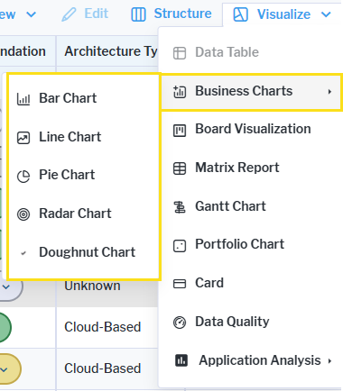
To view the available visualizations available for the data workbench, click the Visualize button. You will see options for business charts which include bar, line, pie, area, radar, and doughnut charts as well as visualizations for boards (kanban), matrixes, timelines (Gantt), quadrant (Portfolio) reports and cards. These visualizations allow you to specify the attributes to analyze as well as other layout options. Preconfigured reports with a fixed thematic scope may also be available under the Analysis section in the Visualize menu.
You can export any of the visualizations to send to colleagues or save any visualization (except preconfigured reports) and add it to the content repository. Visualizations added to the content repository can be added to any content area that you have access permissions to. These saved visualization will always show the most up-to-date data for the assets displayed in the report.