Configure cards to display indicators in content areas
Cards are visualizations of indicator values in content areas. They consist of a heading, the indicator value, and an optional description.
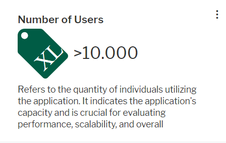
Cards can display single indicator values:
Or they can display multiple indicators belonging to the same evaluation type:
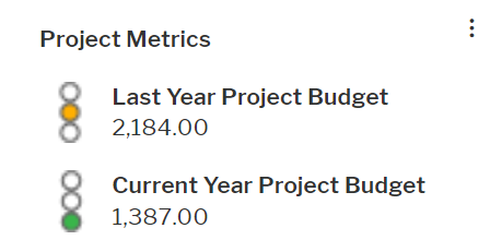
An indicator can be added to both a card with multiple indicators as well as to a separate card. Cards can be created for class-dependent and class-independent content areas. The card will be available in the content repository of the relevant content area.
-
If a unit shall be displayed after the value in the card, the unit must be available as either measurement unit or currency.
- In the left navigation panel, expand Configuration and select Evaluation Types.
- Expand the evaluation type of the indicator in the explorer and click the indicator node beneath it.
- Click Edit.
- In the editor, set the following attributes:
Basic Data tab:
- Description: The description will be displayed beneath the value in the card.
- Add to Content Repository: Set the checkmark.
- Visualization Type: The visualization type must include a widget visualization. You can select one of the following:
- Single Item Cards: The indicator can be displayed in a single card only. It is not available for a grouped indicator card for an evaluation type.
- Single and Grouped Item Cards: The indicator is available for both a grouped indicator card for the evaluation type and a single indicator card. You must define an icon gallery in the Icon tab if you select IconAndWidget.
Widget tab:
- Caption: This field is currently not used. You can leave it empty.
- Widget Definition: Select the widget card template that shall be used to display the indicator. Widget card templates are predefined. They differ in the display of the value.
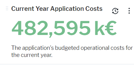
- Single Text or Numerical Value Card: Displays the value of the indicator as number or text. This card is the only one displaying a unit for the value. You can define coloring for value and unit.
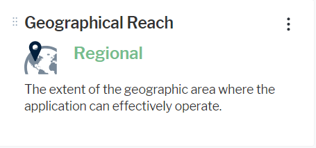
- Icon and Value Card: Displays both the icon defined in the Icons tab and the semantic value of the range defnition for the indicator. You can define coloring for the value.
- IconOnlyCard: Displays the icon defined in the Icons tab.
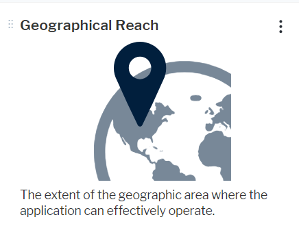
The other widget card templates are for the definition of multi-indicator cards for evaluation types and shall not be selected.
- Single Text or Numerical Value Card: Displays the value of the indicator as number or text. This card is the only one displaying a unit for the value. You can define coloring for value and unit.
- If navigation from the value in the card should be enabled, you must select the type of view that shall open in the Drill Down View Type field and the view in the Drill Down View Name field.
If you don't know the view type and do not find the name of the view in the drop-down list of the Drill Down View Name field, change the selection in the Drill Down View Type field.
- To configure display of a unit symbol or text behind the number, select one of the available unit definitions in the Measurement Unit field or select the Use Default Currency as Measurement Unit checkbox to display the symbol of the default currency of the Alfabet application.
- You can define coloring of the indicator value and unit in cards displaying the value as number or text. Coloring may change when a user selects different themes as Current Theme in the User Settings.
Define static coloring: Select a color definition in the Color Value field.
Define dynamic coloring dependend on the current value: Select a color group in the UI Group field to color multiple ranges with different colors. A table will appear in the editor showing all colors in the selected group. The number of ranges to define is identical to the number of colors defined in the group. In the table, enter a number for the minimum and maximum value that the color represents in the Min. Value and Max. Value columns. You can leave either the Min. Value or Max. Value cells empty in order to include everything below or above a certain value. If there is overlap in the definition of the value ranges, then the first range that matches an indicator value will be used to determine the color.
Icon tab: You must define an icon gallery if you set the Visualization Type of the indicator type to Single and Grouped Item Cards.
Selected an icon gallery in the Icon Gallery field. In the table, enter a number for the minimum and maximum value that the icon represents in the Min. Value and Max. Value columns. You can leave either the Min. Value or Max. Value cells empty in order to include everything below or above a certain value. If there is overlap in the definition of the value ranges, then the first range that matches an indicator value will be used to determine the icon to display. In the Caption cell, enter a tooltip text that explains the numeric values.
-
- In the left navigation panel, expand Configuration and click Evaluation Types.
- Click the evaluation type in the explorer.
- Click Edit and set the following attributes:
Basic Data tab:
- Add to Content Repository: Set the checkmark.
Visualization tab:
- Indicator Group Widget: Select the widget card template that shall be used to display the indicators. Widget card templates are predefined. They differ in the display of the value.
- Horizontal MultiValue Card with Images: Displays the evaluation type name name on top of a horizontal list of indicator type name, indicator icon, and indicator value. If a semantic value is defined, the semantic value is displayed.

- Horizontal MultiValue Card without Images: Displays the evaluation type name name on top of a horizontal list of indicator type name and indicator value pairs. If a semantic value is defined, the semantic value is displayed.

- Vertical MultiValue Card with Images: Displays the evaluation type name name on top of a vertical list of indicator type name and indicator value. If a semantic value is defined, the semantic value is displayed. The icon defined for the indicator value in the indicator type definition is displayed in front of each indicator name and value pair.
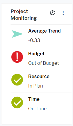
- Vertical MultiValue Card without Images: Displays the evaluation type name name on top of a vertical list of indicator type name and indicator value pairs. If a semantic value is defined, the semantic value is displayed.
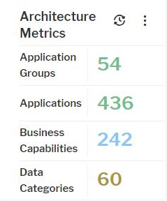
The other widget card templates are for the definition of single-indicator cards for indicator types and shall not be selected.
- Horizontal MultiValue Card with Images: Displays the evaluation type name name on top of a horizontal list of indicator type name, indicator icon, and indicator value. If a semantic value is defined, the semantic value is displayed.
- In the content area of the evaluation type, check the order of indicator types under Indicator Types. Indicators will be listed in the grouped card in the same order from left to right as in the list from top to bottom. Click and hold the first icon in a row and move the row in the table to change the order of indicators in the table.
Changing the order of indicator types in the Indicator Types view also changes the order of indicator types listed in the views for indicator definition, like the Evaluation view for objects.
- Expand the evaluation type node in the explorer and do the following for each indicator that shall be included in the card.
- Click the indicator in the explorer.
- Click Edit and change the following attributes of the indicator:
Basic Data tab:
- Description: The description will be displayed beneath the value in the card.
- Add to Content Repository: Set the checkmark.
- Visualization Type: The visualization type must include icon visualization. You can select one of the following:
- Icon: The indicator is not available for a single indicator card but for a grouped card on evaluation type level.
- IconAndWidget: The indicator is available for both a grouped indicator card on evaluation type level and a single indicator card. You should select this visualization type if you want drill down to be enabled from the grouped card.
Icon tab: Selected an icon gallery in the Icon Gallery field. In the table, enter a number for the minimum and maximum value that the icon represents in the Min. Value and Max. Value columns. You can leave either the Min. Value or Max. Value cells empty in order to include everything below or above a certain value. If there is overlap in the definition of the value ranges, then the first range that matches an indicator value will be used to determine the icon to display. In the Caption cell, enter a tooltip text that explains the numeric values.
Widget tab:
If navigation from the indicator value in the card should be enabled, you must select the type of view that shall open in the Drill Down View Type field and the view in the Drill Down View Name field.
If you don't know the view type and do not find the name of the view in the drop-down list of the Drill Down View Name field, change the selection in the Drill Down View Type field.