Configure cards to display indicators in content areas
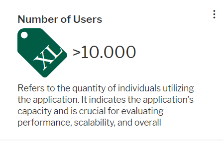
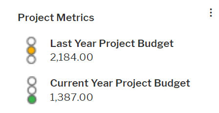
Cards are visualizations of indicator values in content areas. They consist of a heading, the indicator value, and an optional description.
Cards can display single indicator values:

Or they can display multiple indicators belonging to the same evaluation type:

An indicator can be added to both a card with multiple indicators as well as to a separate card. Cards can be created for class-dependent and class-independent content areas. The card will be available in the content repository of the relevant content area.
-
- In the left navigation panel, expand Configuration and select Evaluation Types.
- Expand the evaluation type of the indicator in the explorer and click the indicator node beneath it.
- Click Edit.
- In the editor, set the following attributes:
Basic Data tab:
- Description: The description will be displayed beneath the value in the card.
- Add to Content Repository: Set the checkmark.
- Visualization Type: The visualization type must include a widget visualization. You can select one of the following:
- Single Item Cards: The indicator can be displayed in a single card only. It is not available for a grouped indicator card for an evaluation type.
- Single and Grouped Item Cards: The indicator is available for both a grouped indicator card for the evaluation type and a single indicator card. You must define an icon gallery in the Icon tab if you select IconAndWidget.
Widget tab:
- Caption: This field is currently not used. You can leave it empty.
- Measurement Unit: Enter a unit to be displayed behind the indicator value.
- Widget Definition: Select the widget definition that shall be used to display the indicator. Widget definitions are predefined. They differ in the display of the value.
card type Value Unit Icon BigCardNumber 
The rounded value is displayed without decimals. Displayed in black color. no Card_BigNumber_Decimals 
The value is displayed with two decimals. Displayed in black color. no Card_MonetaryNumber 
The value is displayed with two decimals. Displayed in grey color. no Card_MonetaryNumber_colorRange 
The value is displayed with two decimals. It can be displayed in different colors depending on the value range it lays in. Displayed in grey color. no IconCard 
This card type does not display the exact indicator value. It displays the icon and range caption defined in the icon gallery for the range the indicator value lies in. no The icon defined in the Icon tab of the indicator editor for the indicator value is displayed in front of the indicator. The card types WorkbenchCard , GroupedIndCard ,GroupedVerticalCard , BigCardApplicationArchitecture , BigCardBusinessArchitecture , BigCardInformationArchitecture , BigCardInvestmentArchitecture , and BigCardTechnologyArchitecture are for other use cases and should not be used.
- If navigation from the value in the card should be enabled, you must select the type of view that shall open in the Drill Down View Type field and the view in the Drill Down View Name field.
If you don't know the view type and do not find the name of the view in the drop-down list of the Drill Down View Name field, change the selection in the Drill Down View Type field.
- UI Group: If you have selected the widget Card_MonetaryNumber_ColorRange , you can define coloring for a range of values. Select MetricsColors in the UI Group field to color multiple ranges with different colors. All other currently selectable groups will only allow one range to be colored. In the table, enter a number for the minimum and maximum value that the color represents in the Min. Value and Max. Value columns. You can leave either the Min. Value or Max. Value cells empty in order to include everything below or above a certain value. If there is overlap in the definition of the value ranges, then the first range that matches an indicator value will be used to determine the color.
Icon tab: You must define an icon gallery if you set the Visualization Type of the indicator type to Single and Grouped Item Cards.
Selected an icon gallery in the Icon Gallery field. In the table, enter a number for the minimum and maximum value that the icon represents in the Min. Value and Max. Value columns. You can leave either the Min. Value or Max. Value cells empty in order to include everything below or above a certain value. If there is overlap in the definition of the value ranges, then the first range that matches an indicator value will be used to determine the icon to display. In the Caption cell, enter a tooltip text that explains the numeric values.
-
Group cards do not display the exact indicator values. They display the icon and range caption defined in the icon gallery for the indicator value's range.
- In the left navigation panel, expand Configuration and click Evaluation Types.
- Click the evaluation type in the explorer.
- Click Edit and set the following attributes:
Basic Data tab:
- Add to Content Repository: Set the checkmark.
Visualization tab:
- Indicator Group Widget: Select GroupedVerticalCard to display indicators listed one below the other or GroupedHorizontalCard to display indicators next to each other.
- Expand the evaluation type node in the explorer and do the following for each indicator that shall be included in the card.
- Click the indicator in the explorer.
- Click Edit and change the following attributes of the indicator:
Basic Data tab:
- Description: The description will be displayed beneath the value in the card.
- Add to Content Repository: Set the checkmark.
- Visualization Type: The visualization type must include icon visualization. You can select one of the following:
- Icon: The indicator is not available for a single indicator card but for a grouped card on evaluation type level.
- IconAndWidget: The indicator is available for both a grouped indicator card on evaluation type level and a single indicator card. You should select this visualization type if you want drill down to be enabled from the grouped card.
Icon tab: Selected an icon gallery in the Icon Gallery field. In the table, enter a number for the minimum and maximum value that the icon represents in the Min. Value and Max. Value columns. You can leave either the Min. Value or Max. Value cells empty in order to include everything below or above a certain value. If there is overlap in the definition of the value ranges, then the first range that matches an indicator value will be used to determine the icon to display. In the Caption cell, enter a tooltip text that explains the numeric values.
Widget tab:
If navigation from the indicator value in the card should be enabled, you must select the type of view that shall open in the Drill Down View Type field and the view in the Drill Down View Name field.
If you don't know the view type and do not find the name of the view in the drop-down list of the Drill Down View Name field, change the selection in the Drill Down View Type field.